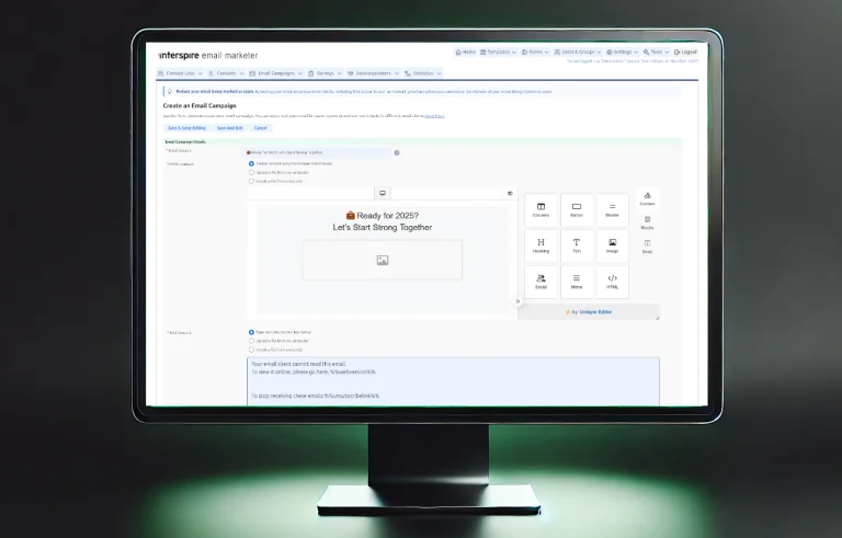
As we get closer to the official launch of Interspire Email Marketer’s refreshed UI, we are excited to give you a detailed preview of the new look. This update enhances the platform’s visual appeal and usability, creating a more intuitive and enjoyable experience. Today, we will walk you through some of the specific changes that make managing your email campaigns and outreach even more efficient.
Refreshed Menus
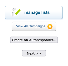
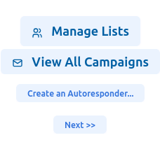
Our first focus was on the platform’s menus. We have refined the layout to create a streamlined, modern look that makes it easier to navigate and access the tools you need. Cleaner lines, less text, and improved spacing help you move seamlessly through your email marketing workflow, with everything you need within quick reach. Here is a side-by-side look at an old and a new menu:


Some minor behavior changes were also implemented. In the past clicking on the main in most circumstances would not only open the menu drop down but also the main view page of the menu – saving a click. Although that behavior did save a click it was sometime counter-intuitive and often resulted in pages being loaded unnecessarily. Now the menus will display on hover over, and clicking on the main menu entry has no effect. A page will be opened upon clicking a menu entry. This aligns more with modern UI/UX practices.
Updated Buttons and Icons
Buttons and icons across the platform now feature a crisper, cohesive design, making interactions simpler and more intuitive. Check out the ‘before and after’ below to see how these improvements make a difference. The subtle font color change across the buttons is intentional.
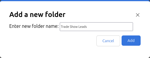
Enhanced Pop-ups
Pop-ups have also received a refresh to provide smoother interactions. These updates are designed to display information you need without disrupting your tasks. Additionally, they can also be styled to match your brand if you choose to white label your instance of Interspire.
More prominent In-line Notifications


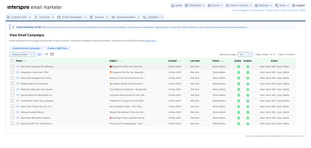
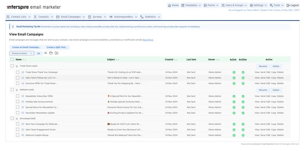
New Folder View for Campaigns and Autoresponders
We are excited to expand the Folder view to the campaigns and autoresponders pages to allow for additional structure to your workspace. This enhancement facilitates campaign autoresponder management, making it easier to organize and access them.
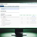
All the campaigns in one list already look pretty good:
The campaigns organized in folders look even better:
Tables Remain Largely Unchanged
We know tables are a crucial part of the platform, particularly for handling the large volumes of data that Interspire manages. While we have introduced a more spacious design across menus, buttons, and pop-ups, we chose to keep the tables largely unchanged to still allow to view as much information as possible.
We may explore ways to further enhance the table layout in the future without compromising on the density of information we can present.
Conclusion
We would like acknowledge the following projects that have enabled us to put this together. We are talking about Tailwind CSS, Tailwind Forms, Tabler Icons, Heroicons, AlpineJS (ok we still use JQuery throughout the app) which themselves rely on a vast ecosystem of top-notch software. Thank you.
We cannot wait for you to experience the refreshed Interspire Email Marketer! This update combines a modern design with familiar usability. Stay tuned for the official release, and get ready to explore the improved interface firsthand.