

BuilderJS Content Widgets
Widgets are the building blocks of a BuilderJS email. Open the Widgets tab in the editor sidebar, then drag any widget onto the canvas to insert it. The palette is organised into three groups: Basic, Image & Text and Text.
For an introduction to the editor itself, see BuilderJS Editor.
Basic Widgets
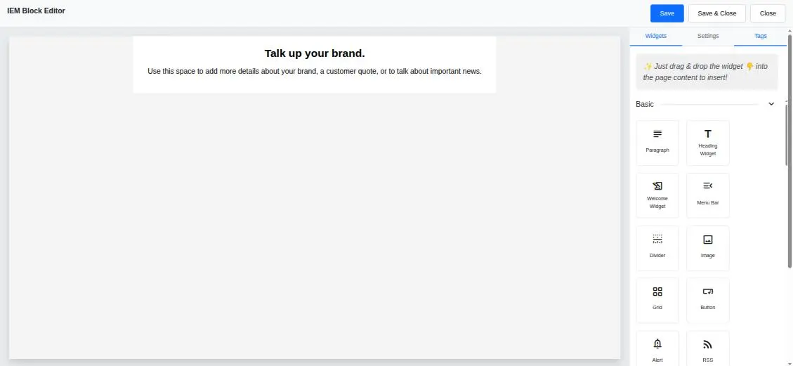
The Basic widget group
| Widget | What it inserts |
|---|---|
| Paragraph | A block of body text with full typography controls. |
| Heading Widget | A heading. Choose H1 (Main Title) through H6 (Smallest Title) in the Settings tab. |
| Welcome Widget | A ready-made introductory section for the top of an email. |
| Menu Bar | A horizontal row of navigation links, for a header nav or a set of category links. |
| Divider | A horizontal rule for separating sections. |
| Image | A single image, uploaded from your computer or referenced by URL. |
| Grid | A multi-column row. Each cell is its own drop target, so you can build side-by-side layouts. |
| Button | A call-to-action button with its own link, colours, padding and alignment. |
| Alert | A highlighted callout for notices, deadlines or terms and conditions. |
| RSS | A feed block that pulls in items from an RSS or Atom feed. See RSS Widget. |
| Social Icons | A row of social media icons, each with its own destination URL. |
| Spacer | Adjustable vertical whitespace between blocks. |
| Footer | A ready-made footer section for your address and unsubscribe link. |
Grid
The Grid widget is how you build multi-column layouts. Select the grid and use the Settings tab to add cells between existing ones or remove cells you no longer need. Each numbered cell accepts its own widgets, so a two-column product row is a grid with an image in one cell and text plus a button in the other.
Grid columns stack vertically on narrow screens, which is what keeps your layout readable on mobile.
Social Icons
Select the widget to manage the icon list in the Settings tab. Each entry expands to show its own destination URL, and you can add, reorder and remove entries. Choose the icon pack that suits your design.
Remember that social icons are images: give each one a sensible link and keep the row short, since some clients block images by default.
RSS Widget v8.7.5
The RSS widget embeds items from an RSS or Atom feed directly into your email — ideal for recurring digests and blog round-ups.
Drag the RSS widget onto the canvas, select it, then configure it in the Settings tab:
| Setting | Description |
|---|---|
| RSS URL | The full feed address. Must start with http:// or https://. |
| Max items | How many of the newest entries to include. Defaults to 10. |
| Show feed header | Displays the feed’s own title and description above the items. Off by default. |
| Show images | Includes each item’s thumbnail image. On by default. |
| Show description | Includes an excerpt of each item’s body text. On by default. |
| Show date | Includes each item’s publication date. On by default. |
| Show “Read more” link | Adds a link back to the full article. On by default. |
| Excerpt length | Number of characters shown per item, between 20 and 500. Defaults to 150. |
| Date format | Long (May 22, 2026), Medium (May 22, 2026) or Short (5/22/26). |
Click Save in the RSS settings to apply your changes. The block re-renders with the feed content so you can see exactly what your recipients will get.
Feeds are fetched by your Interspire server rather than by your browser, so the feed publisher sees a request from your installation and cross-origin restrictions do not apply. Any email merge tags that appear in feed text are stripped from the excerpt, so archived newsletters pulled in from a feed do not leak %%...%% placeholders into your email.
Image & Text Widgets
These are pre-built combinations of an image, a heading, body copy and a call-to-action button — drop one in and replace the placeholder content.
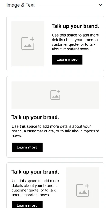
The Image & Text widget group
Variants place the image above, below, to the left of, or to the right of the text, and there are one- and two-column arrangements. Each part of the block remains individually selectable, so you can restyle the heading, swap the image and repoint the button without rebuilding the block.
Text Widgets
The Text group offers pre-built text arrangements — centred blocks, left-aligned blocks and heading-plus-body pairings — for when you want consistent typography without configuring each element by hand.
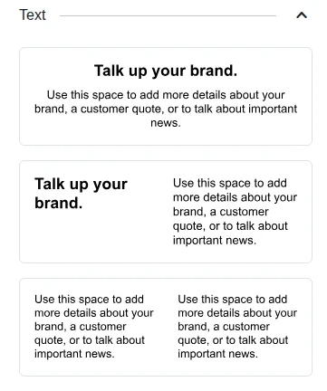
The Text widget group
Styling What You Insert
Every widget you drop is fully editable afterwards. Select any part of it to open its settings, adjust typography, colours, alignment and padding, and use the breadcrumb at the top of the Settings tab to move up to the containing block when you want to change its background or spacing.
See The Editing Window for the full list of element and block settings.
Related Pages
- BuilderJS Editor — getting started with the drag-and-drop editor
- BuilderJS Merge Tags — personalising your content
- Validating an Email — checking how your design renders in real email clients